- Welcome to Bristol Kit Car Club and Forum - BKCC.
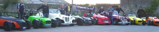
Probably the best Kit Car Club in the world.. Sports cars and classics welcome too!!


 Member Login or Register
New brighter website theme?
Started by 'The Gaffer', 02, March, 2011, 02:30:49 AM
Previous topic - Next topic
User actions
Powered by EzPortal

- Help | Terms and Rules | Go Up ▲
- SMF 2.1.4 © 2023, Simple Machines
Simple Audio Video Embedder
SMFAds for Free Forums
Page created in 0.032 seconds with 37 queries.